Technology
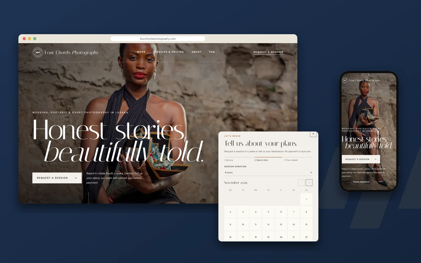
Four Chords Photography: Website & Booking System
A photography website with an online booking-request system and a secure admin dashboard for managing sessions.
Branding
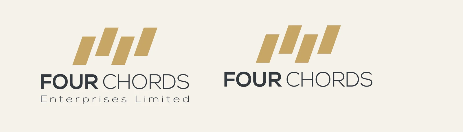
A corporate identity built on four slanted bars: one company, four distinct notes in harmony.
A diversified company needs an identity that can hold very different businesses together without making them look the same. The Four Chords identity does that with one simple geometric idea.
The brand had to feel credible to corporate clients while flexing across technology, photography, beauty and professional services, and it had to work everywhere from a favicon to a letterhead.
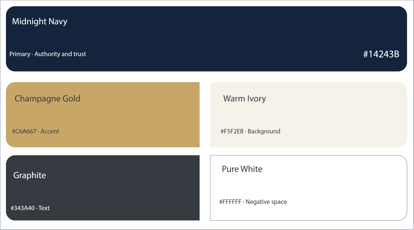
Four slanted bars of different heights form a rising rhythm, four chords in one progression. Midnight Navy and Champagne Gold give the brand weight and warmth, and a clean geometric wordmark keeps it modern and legible.
Explored ideas around harmony, rhythm and growth.
Reduced the mark to four precise geometric bars.
Defined the color palette, typography and usage rules.
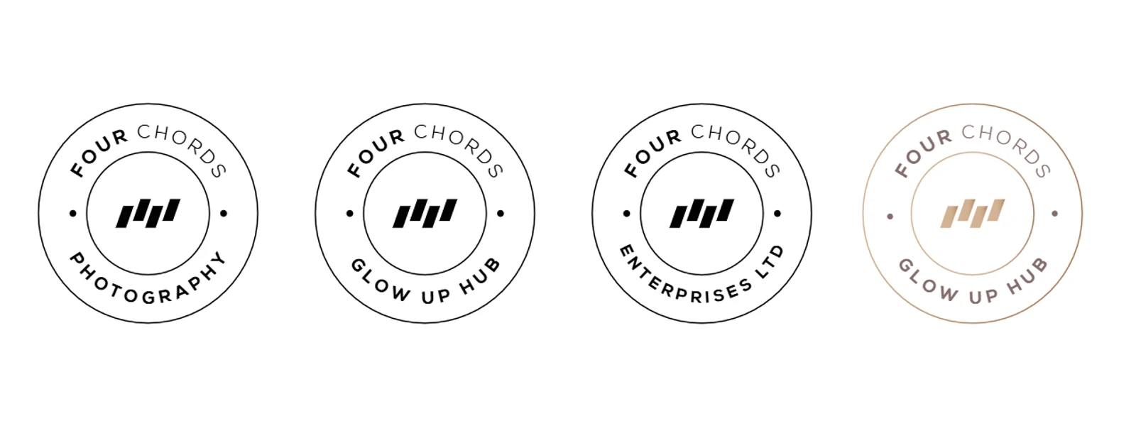
Rolled the identity out across stationery and social channels.


More work
Technology
A photography website with an online booking-request system and a secure admin dashboard for managing sessions.

Technology
Logo, UX/UI design and a responsive website for a Lusaka accounting, advisory and outsourcing firm. Launching soon.
Branding
A new identity and company profile for a Lusaka technology and digital solutions company: a secure shield, wired for digital.
Solutions that move you forward.
Tell us about your project and we will propose a clear plan.